|
|
Post by Hammer on Feb 21, 2016 12:43:29 GMT
#TheBeast 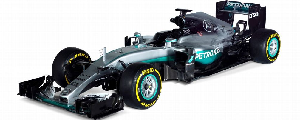 |
|
|
|
Post by LRW on Feb 21, 2016 12:56:35 GMT
Still one of the worst liveries on the circuit.
:/
|
|
|
|
Post by Hammer on Feb 21, 2016 13:11:03 GMT
 It's awesome. Like a Champ which hit the gym and then went to the beach lying on its tummy and got a little too sunburned around the edges, and ready to kick more ass this year.
|
|
|
|
Post by Liam Catterson on Feb 21, 2016 14:08:34 GMT
 WELCOME BACK HRT |
|
|
|
Post by RyRy on Feb 21, 2016 14:15:26 GMT
It doesn't look as tight on the back or sides as McLaren or Ferrari but it looks smoother, the air will glide over instead of being moved around loads by the aero. I wonder what they've done under that because it hardly looks any different on the rear... Look how slick it looks like from this angle:  In comparison last year:  |
|
|
|
Post by Hammer on Feb 21, 2016 15:05:43 GMT
Crap I just noticed, what happened to Blackberry?? Did they finally die?  |
|
|
|
Post by RyRy on Feb 21, 2016 16:48:53 GMT
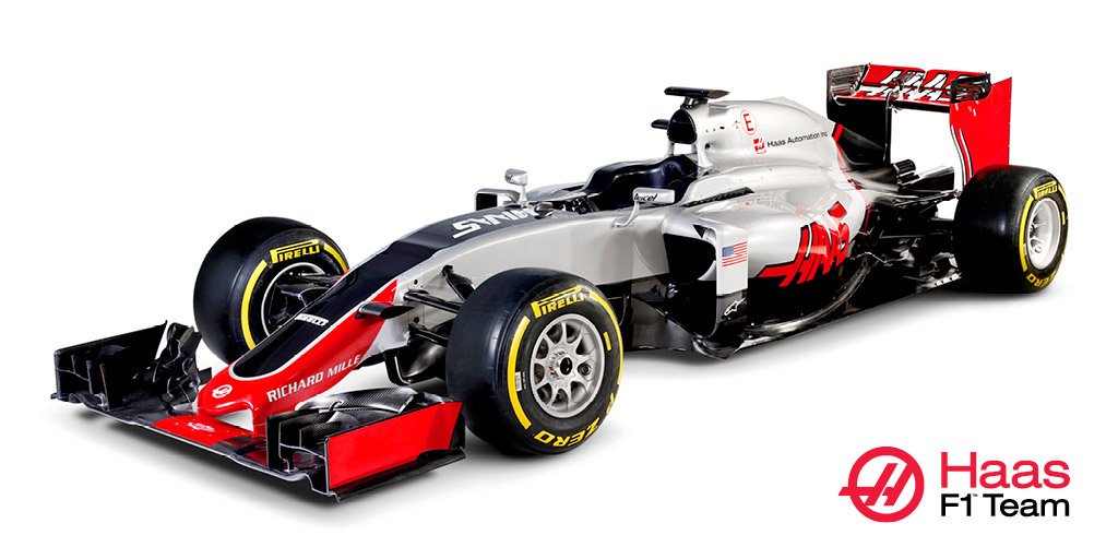
Look at how angled the rollhoop air-inlet is now for Mercedes the and like I mentioned before, another huge inlet. imgur.com/a/nTj9WThe random red on it looks freaking weird but I actually love that its different looking. I'm surprised Hass has such a small inlet, it looks a pretty bog-standard car, nothing special anywhere as far as I can see. The one thing I find weird is the ridge on the just above the front tyres on the nose of the car. I guess that's the s-duct being covered up...  /photo/1 |
|
|
|
Post by racechick on Feb 21, 2016 18:03:23 GMT
I really like the McLaren, much better than last year. Doesn't say McLaren on it which is a bit weird. I love the Merc  Also better than last years. I'm not keen on the Hass. Boring and nondescript. |
|
|
|
Post by stonemonkey on Feb 21, 2016 22:44:27 GMT
I don't mean to be mean, but my first thought was 'that's a good looking backmarker'. 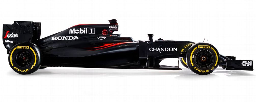 That's no backmarker. I hope. |
|
|
|
Post by Frontrunner on Feb 22, 2016 1:48:56 GMT
I don't mean to be mean, but my first thought was 'that's a good looking backmarker'. Reminds me of the 2010 Hispania. |
|
|
|
Post by Frontrunner on Feb 22, 2016 2:18:00 GMT
The extra black with the Petronas green doesn't go to well on the Merc for me, 2015 livery is much better IMO, Its always going to be hard for Merc with that awful Petronas green.
|
|
|
|
Post by RyRy on Feb 22, 2016 3:44:53 GMT
The extra black with the Petronas green doesn't go to well on the Merc for me, 2015 livery is much better IMO, Its always going to be hard for Merc with that awful Petronas green. It's crazy how someone can love a design and someone can dislike/hate it. I think the latest livery from Mercedes looks by FAR their best so far, it looks so sleak, smooth and flowing to me. Fades all nicely together. |
|
|
|
Post by Frontrunner on Feb 22, 2016 4:22:04 GMT
Everybody's got a different taste of things, But I do agree with RC's summary about the Haas, Boring and non descript. There was a little whisper last year that the Haas could possibly have a yellow livery which I would have welcomed but wasn't the case.
|
|
|
|
Post by LRW on Feb 22, 2016 5:56:05 GMT
This year RedBull has won the livery competition.  |
|
|
|
Post by LRW on Feb 22, 2016 8:50:48 GMT
I think the McLaren actually looks quite fierce. Lets hope it performs as good as it looks !  |
|
|
|
Post by racechick on Feb 22, 2016 8:53:16 GMT
I think it's cool, a vast improvement over last year.
|
|
|
|
Post by RyRy on Feb 22, 2016 8:56:38 GMT
This year RedBull has won the livery competition. Disagree personally, although the worst for me is Toro Rosso... it's black. Although in better light, the Red Bull looks better than the pictures we already had:  |
|
|
|
Post by LRW on Feb 22, 2016 9:17:04 GMT
And this looks even worse on the track....   |
|
|
|
Post by LRW on Feb 22, 2016 9:52:50 GMT
Haas is safe, we have a winner for Vile Livery of 2016.... 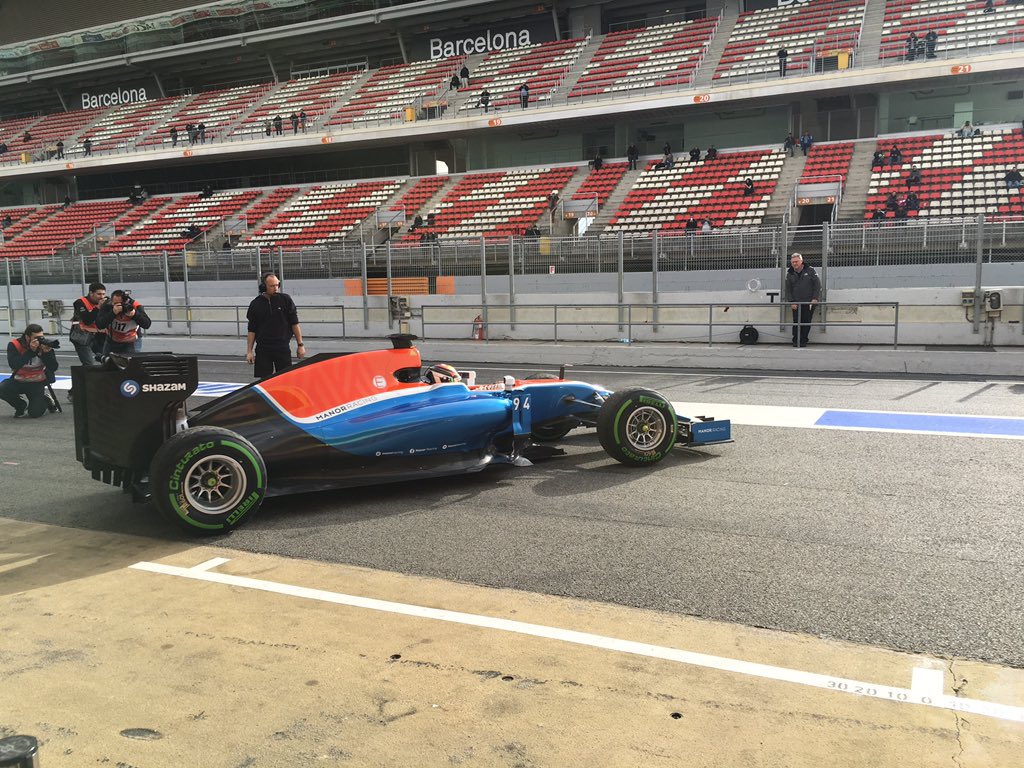 |
|
|
|
Post by racechick on Feb 22, 2016 10:10:52 GMT
Yes that's pretty grim.
|
|


 It's awesome.


 Also better than last years.


